Whop-wide Internal

4.8 (99 Reviews)
this is a whop to talk about all things whop
Sacramento, US
Created byProfile pictureSteven Schwartz
582 joined
Profile picture
Artur Bień@arturbien·Mar 6

# New: Toast Component in Frosted UI


We've added a built-in toast notification system to Frosted UI, replacing our dependency on Sonner. This gives us full control over styling, animations, and behavior — all integrated with our design tokens.


## Why


- No more external dependency — Sonner required unstyled: true plus manual classNames to match our design system. Now toasts use Frosted UI tokens natively.

- Built on Base UI — Uses @base-ui/react/toast under the hood for accessibility (ARIA live regions, keyboard navigation, focus management) with our own styling and interaction layer on top.

- Sonner-compatible API — The imperative toast() API is nearly identical to Sonner's. Most call sites only need an import change.


## Setup


Drop <Toaster /> inside your <Theme> — it renders its own portals, no wrapper needed:


import { Toaster } from 'frosted-ui';

<Theme>
  <App />
  <Toaster position="bottom-right" timeout={5000} limit={3} />
</Theme>


## API at a Glance


import { toast } from 'frosted-ui';

// Variants
toast('Notification received');
toast.success('Changes saved');
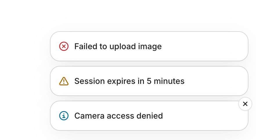
toast.error('Upload failed');
toast.warning('Session expires in 5 minutes');
toast.info('Camera access denied');
toast.loading('Connecting...');

// With description
toast.error('Withdrawal failed', {
  description: 'Insufficient balance. Try a smaller amount.',
});

// With action button
const id = toast.success('Message archived', {
  actionProps: {
    children: 'Undo',
    onClick: () => toast.dismiss(id),
  },
});

// Promise pattern (loading → success/error)
toast.promise(saveChanges(), {
  loading: 'Saving...',
  success: 'Saved!',
  error: 'Something went wrong',
});

// Loading → replace (manual control)
const id = toast.loading('Generating stream key...');

// later...
toast.success('Stream key ready', { id });

// Dismiss
toast.dismiss(id);
toast.dismissAll();

// Per-toast positioning
toast.success('Done', { position: 'top-center' });


### Positions


bottom-right (default), bottom-left, bottom-center, top-right, top-left, top-center


Each position maintains its own independent stack.


## Custom Toasts


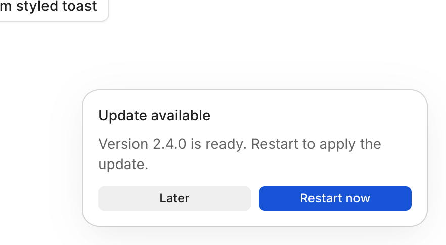
For anything beyond the standard layout, use toast.custom(). The render callback receives { close, id, Toast } with composable sub-components:


toast.custom(
  ({ close, Toast }) => (
    <Toast.Root>
      <Toast.Content>
        <Toast.Title>Update available</Toast.Title>
        <Toast.Description>v2.4.1 is ready.</Toast.Description>
        <div style={{ display: 'flex', gap: 'var(--space-2)' }}>
          <Button size="1" variant="soft" onClick={close}>Later</Button>
          <Button size="1" variant="solid" onClick={() => { close(); restart(); }}>
            Restart now
          </Button>
        </div>
      </Toast.Content>
    </Toast.Root>
  ),
  { duration: Infinity },
);


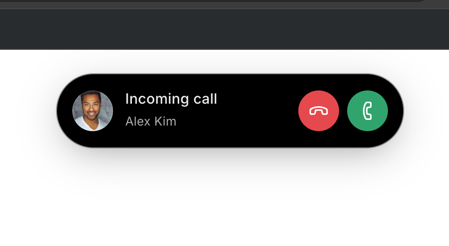
Hooks work inside the callback — it's treated as a component. You can build file upload progress bars, incoming call notifications, multi-action prompts, or anything else.


## Deduplication


Pass an explicit id to prevent duplicate toasts. If a toast with that ID already exists, it updates in place with a subtle bounce animation:


toast.error('Network disconnected', { id: 'network-status' });
// Later, same ID resolves it:
toast.success('Network restored', { id: 'network-status' });


## Telemetry / Sentry


The onToast callback on <Toaster> fires once per toast creation:


<Toaster onToast={(t) => {
  if (t.type === 'error') {
    Sentry.captureMessage(String(t.title), { level: 'error' });
  }
}} />


## Storybook


All patterns are documented in with interactive examples for every variant, promise patterns, custom content, deduplication, positioning, and more.
file_qcC9qjSD60UWg
file_2ve0vnBFkB7r0
file_f0hTlzW0uAKru
Profile picture
Tim Guiteras@timmy·Mar 16

Niceee

Profile picture
Artur Bień@arturbien·Mar 2

# New component: ScrollGallery


Hey team -- we just shipped a new primitive: *ScrollGallery**. Here's what you need to know.


## What is it?


A headless compound component for building any UI that involves a scrollable container with navigation. Think: product image viewers, testimonial carousels, feature tours, horizontal card lists, timelines -- anything where users scroll through items with optional buttons and dot indicators.


It is **not** a carousel library. There's no drag, no autoplay, no opinionated layout. It handles the logic, accessibility, and state. You bring the styles.


## Why did we build it?


The upcoming CSS Overflow Level 5 spec introduces native ::scroll-button(), ::scroll-marker, and ::scroll-marker-group pseudo-elements that will solve this at the platform level -- but browser support is years away. This component implements the same concepts and algorithms in React so we can use them today, and the mental model will map cleanly to the native API when it lands.


## Quick start


import { ScrollGallery } from 'frosted-ui';

<ScrollGallery.Root>
  <ScrollGallery.Viewport style={{ overflowX: 'auto' }}>
    <div style={{ display: 'inline-flex', gap: 16 }}>
      <ScrollGallery.Item>Card 1</ScrollGallery.Item>
      <ScrollGallery.Item>Card 2</ScrollGallery.Item>
      <ScrollGallery.Item>Card 3</ScrollGallery.Item>
    </div>
  </ScrollGallery.Viewport>

  <ScrollGallery.Previous>Prev</ScrollGallery.Previous>
  <ScrollGallery.Next>Next</ScrollGallery.Next>

  <ScrollGallery.ScrollMarkerGroup style={{display: 'inline-flex', gap: 4}}>
    <ScrollGallery.ScrollMarker index={0} />
    <ScrollGallery.ScrollMarker index={1} />
    <ScrollGallery.ScrollMarker index={2} />
  </ScrollGallery.ScrollMarkerGroup>
</ScrollGallery.Root>;


That's it. The buttons auto-disable at boundaries, markers track the active item, and everything is keyboard accessible out of the box.


## Features at a glance


- **Page-based scrolling** -- buttons scroll by ~85% of the viewport (like PageDown), not by one item

- **Step-by-item scrolling** -- add step={1} to buttons for single-item navigation

- **Loop mode** -- loop prop wraps navigation at boundaries

- **Scroll snap aware** -- adapts to your scroll-snap-align CSS (start, center, or end)

- **Active marker tracking** -- implements the CSS spec's algorithm with redistribution at scroll boundaries

- **Vertical support** -- orientation="vertical" flips everything

- **Imperative API** -- ref.scrollTo(index) for programmatic navigation

- *defaultValue** -- initialize at any slide on mount with no flash

- *onValueChange** -- callback with source info "scroll" vs "indicator")

- **Reduced motion** -- respects prefers-reduced-motion automatically

- **Rich data attributes** -- data-active, data-in-view, data-scrolling, data-can-scroll-prev, etc. for styling with CSS


## Things to keep in mind


- **No tabIndex on the viewport by default.** The viewport has keyboard handlers wired up (arrows, Home/End, PageUp/Down) but it won't be focusable unless consumers add tabIndex={0}. This is intentional -- adding a tab stop should be a deliberate choice, not something we force.


- **No hardcoded ARIA labels.** We don't bake in aria-label="Previous" or similar -- you need to provide labels in the appropriate language.


- *Root renders no DOM.** It's a context-only provider. Your layout structure is entirely up to you.


- **Scroll snap is optional.** The component works with or without scroll-snap-type. Add it in CSS if you want snapping behavior.

You can play with the component in the Storybook:

Profile picture
Mahir Oberai@mahiro·Mar 5

sick

Profile picture
Steven SchwartzProfile picture@s·Mar 2

So many interesting businesses being launched on the platform

Profile picture
Nicholas Motamedi@iamthemoat·Feb 28

ramadan mubarak

Profile picture
Gustavo@gustavooooo·Feb 25

new pricing page in network site live!


Profile picture
Colin McDermott@colin·Feb 27

Should the "Contact sales" button not point to ?

Profile picture
Keisha@keishasingleton·Feb 26

🦄

Profile picture
Artur Bień@arturbien·Feb 23

Card component update

  • Simplified html structure so no more fui-CardInner element -> makes it much easier to override Card styles

  • Added ghost and outline variants

See the updated Card component in the

file_PktlAT9lML2pJ
Profile picture
Artur Bień@arturbien·Feb 19

Small <Skeleton /> update ✨


In the latest Frosted version the skeleton pulse animation will be synced across all instances of Skeletons on the page, no matter where or when they appeared on the page

You can see the demo in this

Profile picture
Mike Turck@zomg·Feb 19

how does the syncing work?

Profile picture
Artur Bień@arturbien·Feb 19

# New component: Combobox


A select-like input that lets users pick one or multiple items from a filterable list. Built on Base UI primitives with full frosted-ui styling.


## What it does


- Single or multiple selection from a list of items

- Type-ahead filtering with keyboard navigation

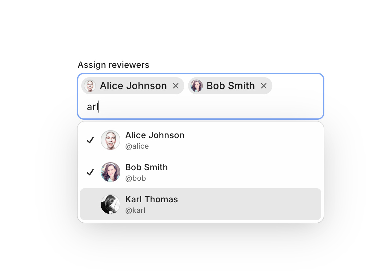
- Chips for multi-select with remove buttons

- Integrates with TextField, ScrollArea, Field, and Form out of the box

- Sizes 1–4, all standard color and variant props


## What's different from Autocomplete


Autocomplete is for free-form text input with suggestions — the user can type anything. Combobox is for structured selection — the user must pick from the list. Use Combobox when you need to remember what's selected.


## What you get


Size context — set size on Root once, it flows to the input, popup, and chips automatically.


Auto-anchoring — the popup anchors to the input or chips container without manual ref wiring.


TextField integrationCombobox.InputRoot renders a styled TextField.Root with a built-in dropdown trigger and optional clear button. No manual composition needed.


Chip theming — chips support variant (soft/solid), color, and highContrast, matching Badge styling.


## Use cases


- Single selection with search: country picker, timezone selector, assignee picker

- Multi-select with chips: tag picker, label manager, multi-user assignment

- Async search: user lookup, product search — supports controlled open state and loading indicators

- Creatable: let users add new items when nothing matches (e.g., label creation in an issue tracker)

- Form integration: works with Field.Root, Field.Label, Field.Error, and Form for validation

- Trigger-only mode: use a Button as the trigger without an input field, similar to Select

- Input-inside-popup: render the search input inside the popup for command palette patterns


## Quick example


<Combobox.Root items={users} size="2">
  <Combobox.InputRoot>
    <Combobox.Input placeholder="Select user..." />
  </Combobox.InputRoot>
  <Combobox.Content>
    <ScrollArea type="auto">
      <Combobox.Empty>No users found.</Combobox.Empty>
      <Combobox.List>
        {(user) => (
          <Combobox.Item key={user.id} value={user}>
            {user.name}
          </Combobox.Item>
        )}
      </Combobox.List>
    </ScrollArea>
  </Combobox.Content>
</Combobox.Root>


Multi-select with chips:


<Combobox.Root items={tags} multiple size="2">
  <Combobox.Chips>
    <Combobox.Value>
      {(values) => values.map((tag) => (
        <Combobox.Chip key={tag.id} value={tag}>{tag.name}</Combobox.Chip>
      ))}
    </Combobox.Value>
    <Combobox.ChipsInput placeholder="Add tags..." />
  </Combobox.Chips>
  <Combobox.Content>
    <ScrollArea type="auto">
      <Combobox.Empty>No tags found.</Combobox.Empty>
      <Combobox.List>
        {(tag) => (
          <Combobox.Item key={tag.id} value={tag}>{tag.name}</Combobox.Item>
        )}
      </Combobox.List>
    </ScrollArea>
  </Combobox.Content>
</Combobox.Root>


Check the demos for async search, creatable, form validation, grouped items, and more.

file_z8kyruqSja2sV
Profile picture
Mike Turck@zomg·Feb 19

fire

Profile picture
Steven SchwartzProfile picture@s·Feb 17
Pinned post

Yooo welcome to Whop wide internal. This is Whop on Whop.


Everyone in the world can see this!

Profile picture
Neeraj chaurasiya @nirajchaurasiya·Jul 30

Hlo